Side project
Improving findability of important and time-sensitive messages for carers of one or more young children.
Messaging board not used to its potential
Background
ParentHub is a parent-school messaging service that ensure parents are informed about their child’s education.
Business goal
ParentHub aims to enable parents to receive updates that matter most, making school-parent communication effortless.
Challenge
Users see the application as a noticeboard, however it also allows to navigate between channels and save urgent messages.
Impact
I made channel signposting easier to use and notice.
I ensured parents are able to use the saving feature the app already provides,
which was not obvious for the users.
From assumptions to learnings in usability testing
As a designer using the application in my personal life, I came into this project with assumptions about the way parents save messages and navigate the application.
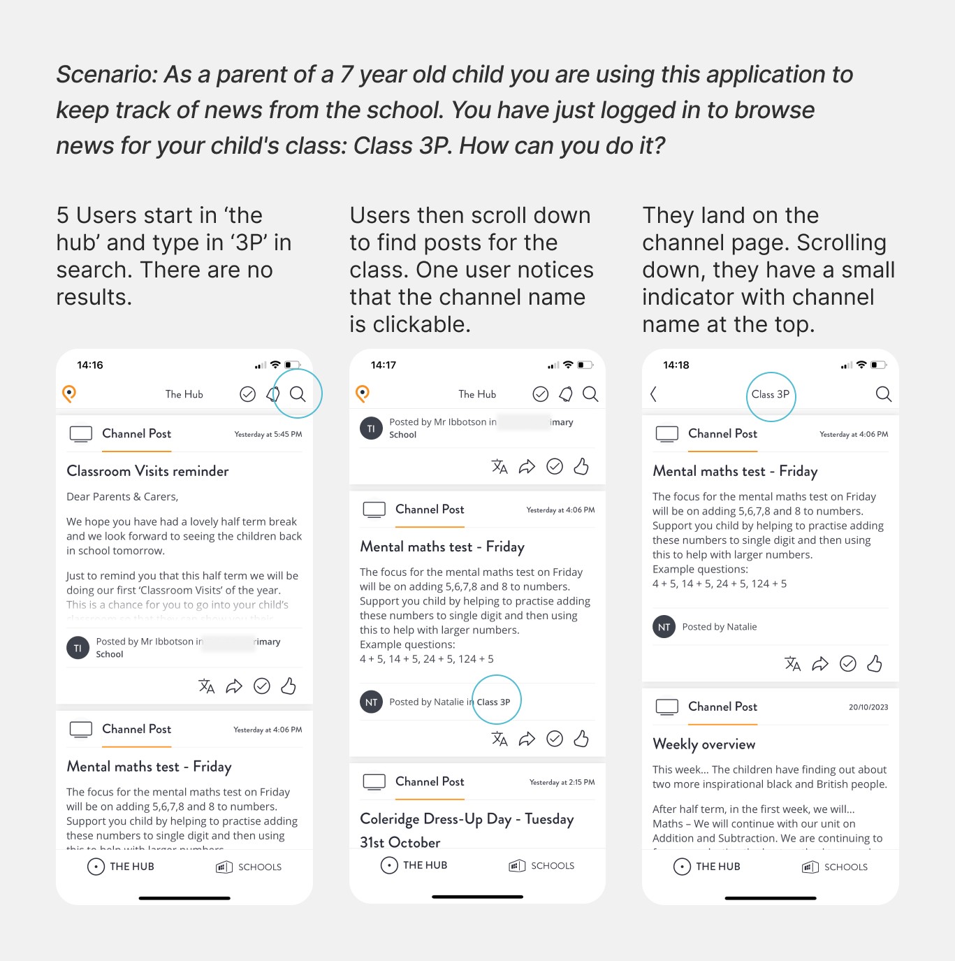
Unaware they can switch between channels, people rely on search function to find messages of certain types.
I wanted to see if the users are indeed able to find the updates about the class their child is in. In addition to that, I wanted to explore how the users would make sure they do not lose the update in the stream of others.
Where one channel ends and the other begins
"The search doesn't take me where I'd like to go"
Users initially searched for class posts (e.g., ‘3P’) directly but, after unsuccessful searches, reverted to browsing the original page for relevant messages.
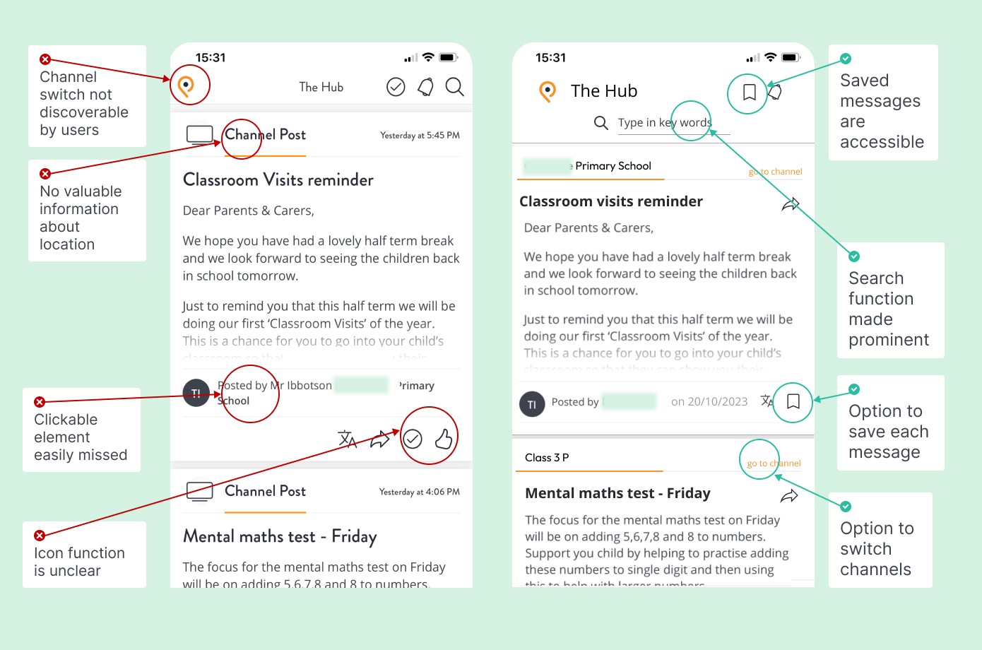
"Where am I now?"
Most users found it difficult to determine their location within the app due to the small heading size, with two users failing to notice the heading at all.
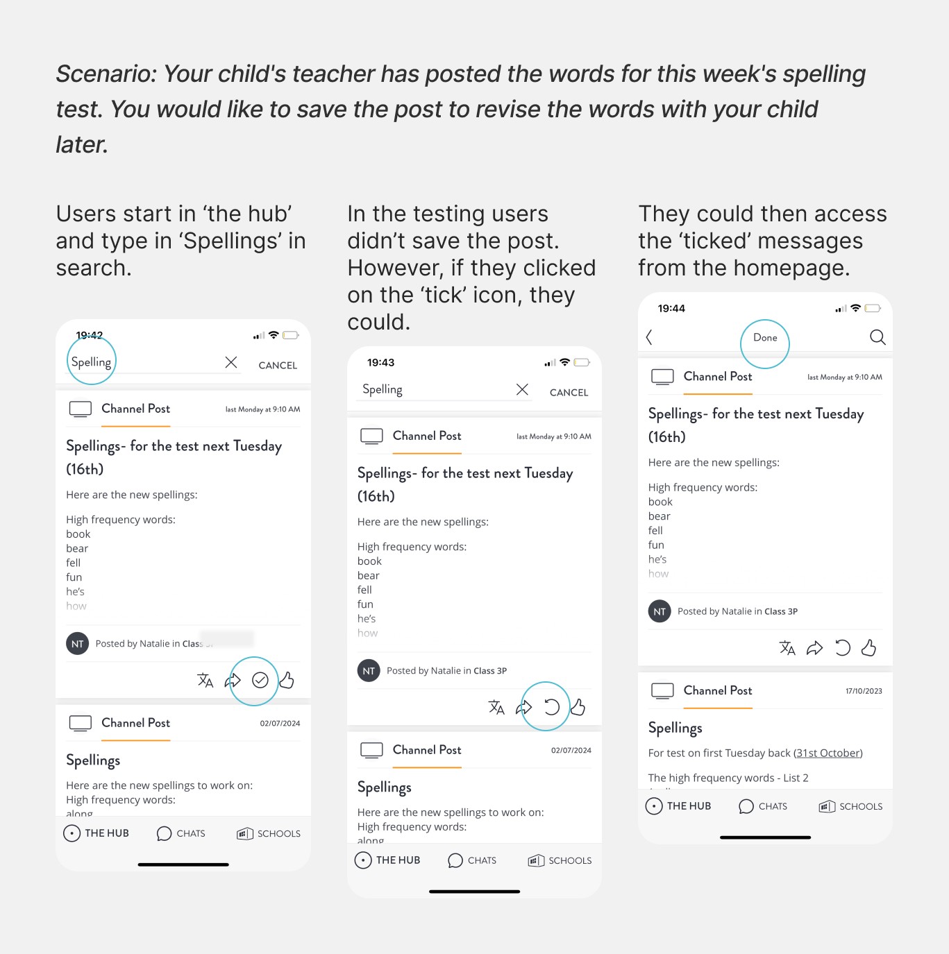
The save function is there, but users don't see it
"What does this checkmark do?"
The purpose of icons, especially the ‘tick’ icon, was unclear to users. Users were unsure of the ‘like’ button's function and did not use it to save posts.
"I'd expect to be able to save a message, but how do I do this?"
4 out of 5 users expected a ‘save’ function, with 1 user mentioning they would use the ‘share’ button to email posts to themselves.
Communicating the idea of channels
I focused on clarity of channels, as many parents have more than one child, so the channels they need to follow can multiply quickly.
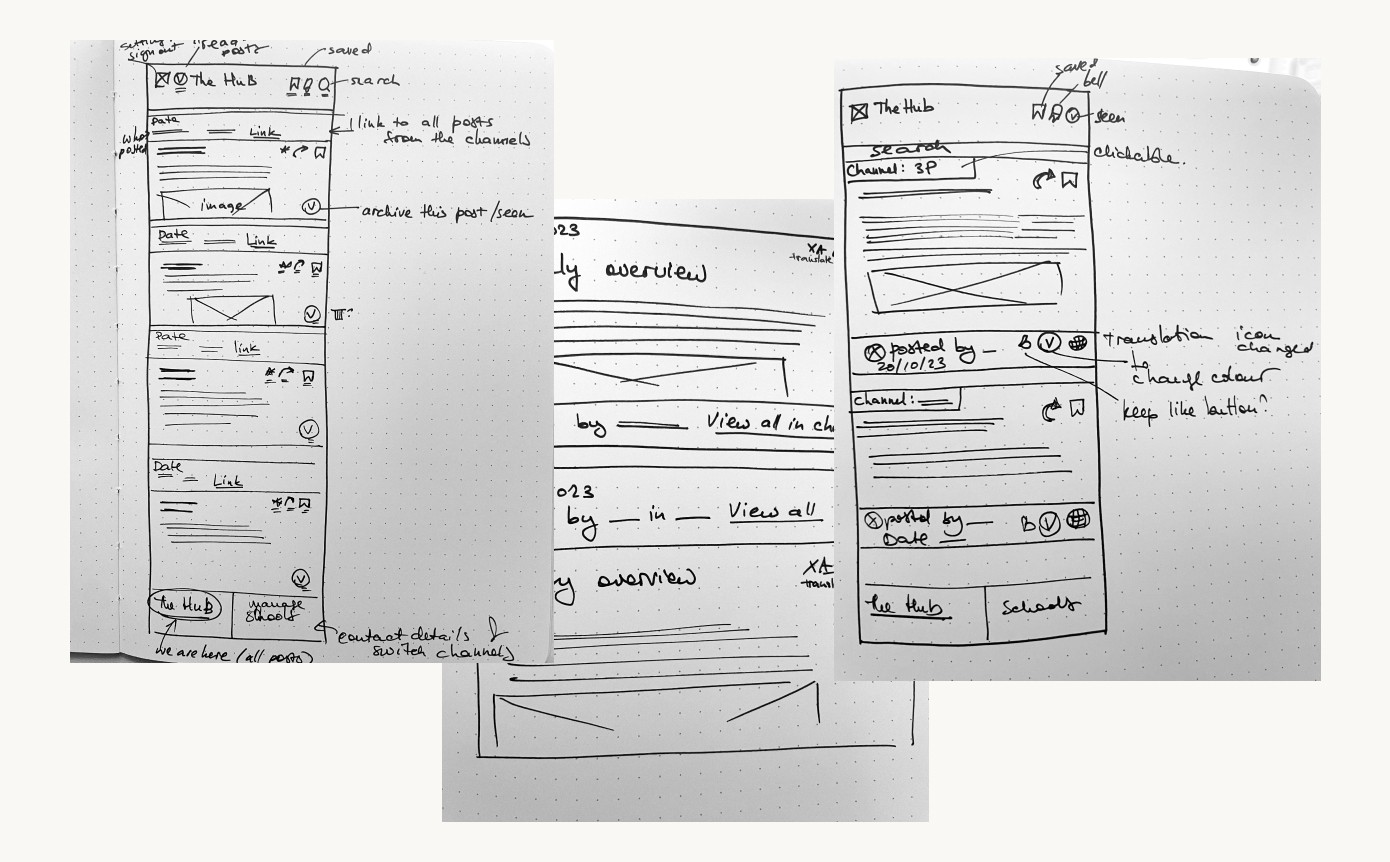
Learnings from the first prototype
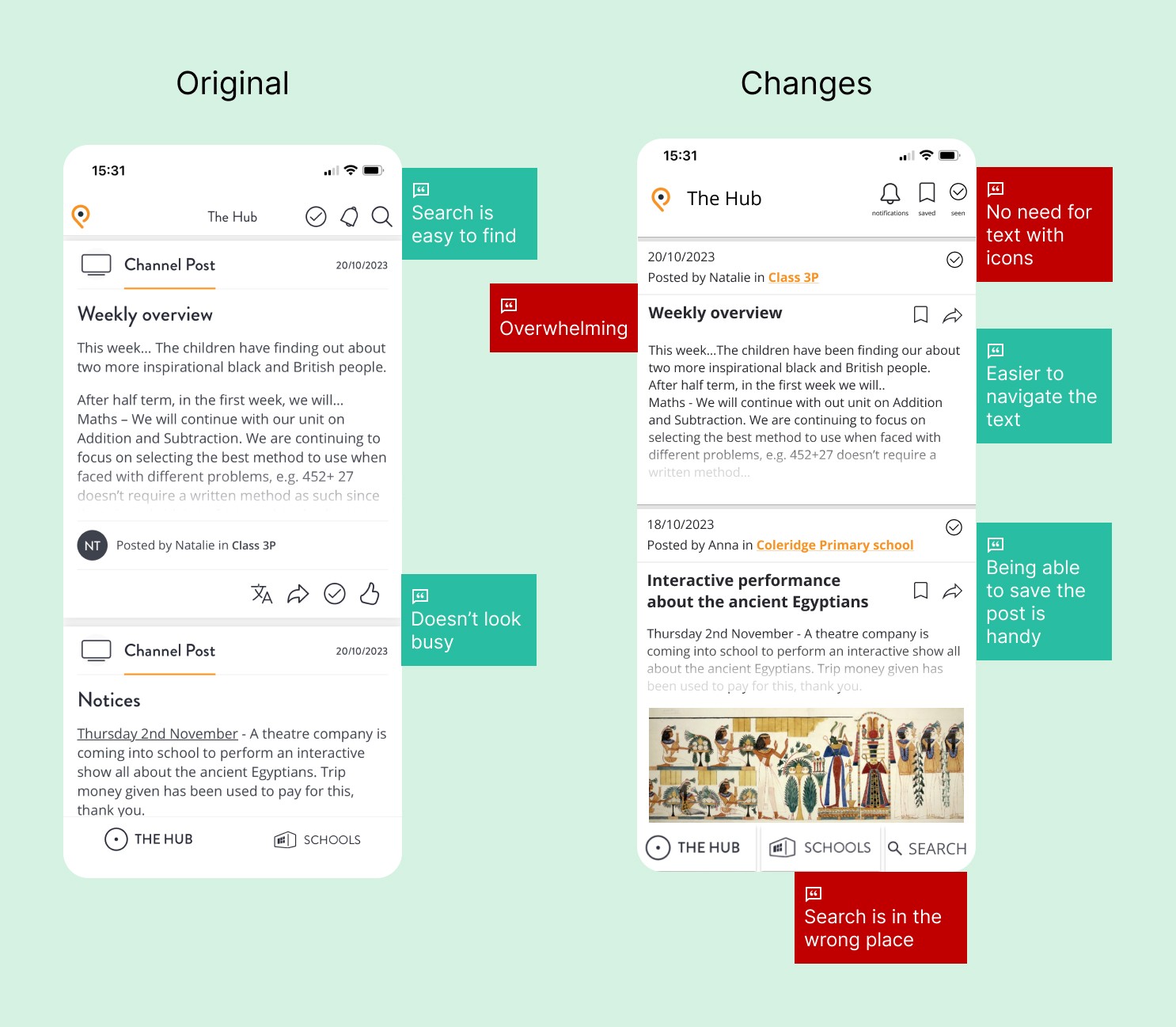
Keeping in mind the two scenarios, I have made changes to the hub page and the individual message card. In hindsight, too many changes have been implemented which led to too many differences in the designs. This was amended with the second prototype.
Finding the right channel
Each message card features a link with the name of the channel in accent colour, for users to quickly notice the message’s corresponding channel.
Added a link to class channel in each post, using the accent colour
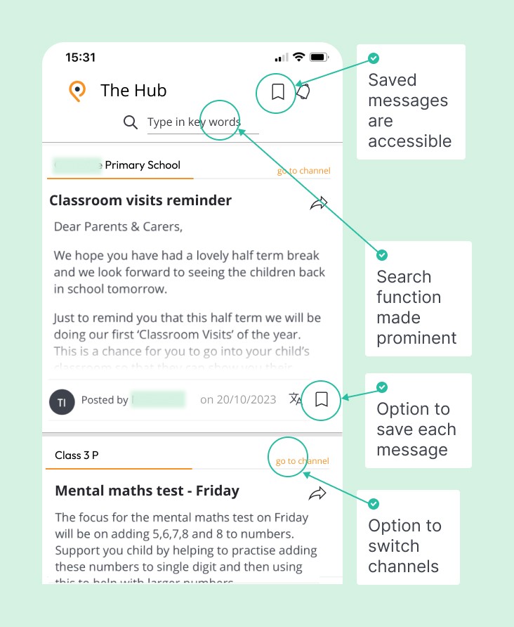
Moved search function to the bottom of the screen
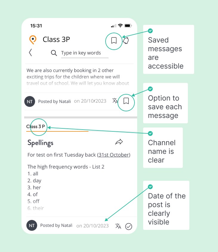
Enlarged the channel heading to clearly signify which channel the user is in.
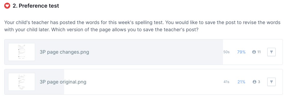
Saving the post
I introduced a bookmark feature to give users the ability to save the posts. This feature is added to the navigation panel and the message card.
Added the option to bookmark a post
Kept the checkmark icon but moved it to the top of the post, as is commonplace in organising emails
Enlarged the post headings and made them more meaningful
Summary
The number of changes I had made to the initial design contributed to skewing the results. I got valuable feedback about the new version, but for the future testing I needed to be more consistent in the changes.
It is now easier to switch between channels and save the post
I pursued the goal of making the path to the message channel clear, ensuring the option to save the post is visible. The changes made to to the original were more precise and directly targeting the issues.
Second prototype features
Added the link to class channel in line with the original design, to ensure the users know what channel the post is in
Kept the search function, but specified the way that search work
Added link to channel to the card
Enlarged the post headings
Removed the ‘like’ icon
Added the option to bookmark a post
Kept ‘translation’ icon
Moving forward
Provided I had access to analytics and technical restrictions, I would dive deeper into analysing user tasks and perform continuous iterations.
Next steps include detailed task analysis, ongoing user communication, refining prototypes, and using analytics tools to track and implement changes.
The usability test highlighted issues with navigation, and to understand them deeper a detailed task analysis is needed, to answer questions like 'What else do users do on the platform, besides locating the messages and saving them?'
After analysing the scenarios, I would set up ongoing communication with users, to find out about pain points and opportunities within the application.
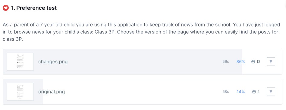
I would build upon the insights gained from the preference test to create refined prototypes.
If I had access to the app's analytics, I would then single out and implement changes to one user task, setting up tools like Google Analytics and HotJar to track success rate.
I learned the importance of iterative testing, involving diverse users, and making gradual design changes to effectively align with user preferences and behavior.
By involving more users in the second test, I better aligned the design with user preferences and behavior.
The project highlighted the value of continuous improvement. By analysing and acting on the results of the Preference tests, I was able to refine the design and achieve better results.
For the usability test I recruited users who are not only parents, as I wanted to see how they would use the navigation; recruiting target user participants can help glean more insights.
I learned the importance of iterative testing. The first Preference test revealed that making too many changes to the design at once can lead to failure. It emphasized the need for gradual, controlled modifications to track their impact effectively.