Overview
The business required a customised dashboard to gain insights into the performance of their events and to make data-driven decisions related to sales, advertising, and customer service.


Background
School of UX is a company that provides design courses and organises UX Conf - a large UX conference with both on-site and remote access.
My Responsibilities
To create a dashboard for the School of UX website that would include the following content:
Total Net Sales: To determine the profitability of events.
Number of Spaces Left: To manage advertising spend effectively, especially closer to the date of the conference.
Latest Orders: To quickly amend, refund, or export receipts and the ability to search by ticket buyer's name or order number.
Customer Locations: To identify countries worth investing in for advertising.
Traffic Sources: To assess the effectiveness of marketing campaigns.
Filter Data: To allow users to contextualise the data by location and date range.
Content comes before design
I started with arranging the content on the wireframe to visualise the layout and structure of the dashboard.
Staying mindful of future changes and element positioning
Using multiple grid system allowed me to position elements with precision. Some reusable components have their own grid, so that the dashboard can be used on a variety of devices.

Creating Components
I developed responsive components, ensuring that the dashboard could adapt to various screen sizes and devices. This responsiveness enhances the user experience by making the dashboard accessible and functional on both desktop and mobile platforms.

The final design meets the business goals
The dashboard helps UX Conf streamline their operations, increase profitability, and make advertising more effective, ultimately improving their overall event management process.
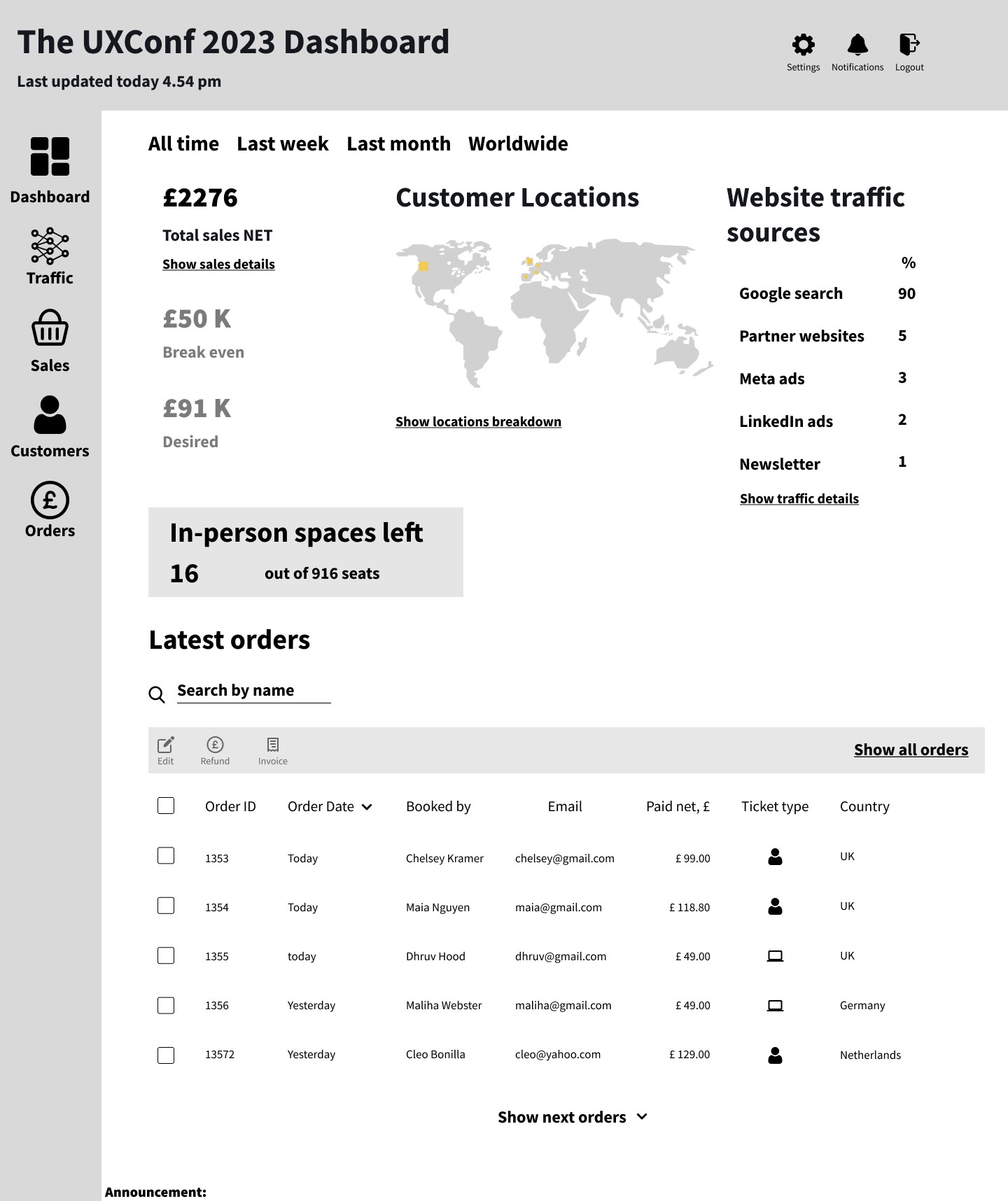
The new dashboard includes the following information:
Total Net Sales: The dashboard provided a clear overview of net sales, helping the client determine event profitability
Number of Spaces Left: Users could monitor ticket availability, making it easier to manage advertising campaigns effectively, especially as the conference date approached
Latest Orders: The improved search functionality allowed users to quickly locate and manage specific orders and export receipts.
Customer Locations: The dashboard presented user location data visually, assisting in making informed advertising decisions.
Traffic Sources: Users could easily identify the sources of website traffic, enabling effective evaluation of marketing campaigns.
Filter Data: The dashboard allowed users to contextualize data by location and date range, providing a comprehensive overview tailored to their needs.

Moving forward
Like all prototypes, this design must be tested with users to determine its effectiveness in optimising sales and ensuring accessibility.
Next Steps
Gather feedback on the initial design to identify areas of improvement by conducting usability testing.
Conduct contextual inquiries to notice how the users interact with the dashboard and what needs might be still unmet.
Implement feedback mechanisms (e.g., notifications, alerts) to keep users informed about important updates, changes, or issues related to the events.
Better understand how to prioritise the most crucial metrics and arrange them hierarchically based on their importance.
Learnings
With this project I have strengthened my ability to prioritise content and determine the business requirements effectively from the outset of the project.
I also refined my UI skills by using multiple grids and designing components in accordance with the principles of atomic design.